

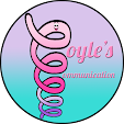
I just drew my own logo in photoshop and I LOVE it! I drew it on paper first and wasn't sure if I was going to be able to draw it myself or not, but I did! My last name is Coyle which sounds like coil. So I drew a cute animated coil with a face. The parts of the coil also look like the letter C. So they also serve as the first letter of both Coyle's and Communication, since my blog and TpT teacher store name are Coyle's Communication. I love the play on words with the homonym of my name, coil, and the visual of the coil also serving as the Capital C's in both words. Homonym and alliteration for an SLP- loving it!
I came up with the idea, drew it on paper, then drew it in photoshop- all by myself. The font is a free for Commercial Use font, Lobster. Lobster is one of my all time favorite "script" fonts. The colors are my three favorite colors in this order: pink, purple, and teal!
So what do you think of my new logo? Cute?


0 comments:
Post a Comment